I was pleased with my final product however I wish I'd had better quality videos and more time to do the film.
Wednesday, 8 December 2010
Using premiere pro was a bit different for me as I am used to using final cut pro, however I found it easy to navigate, I started off by cutting my clips down using the razor tool so that I had about 1 minute of footage, I then decided to incorporate pictures from the comics into my film, I decided to edit them quickly together to make it more interesting to watch. I decided to split the film into two one half showing the main protagonists and the others showing there enemies the superheros, I felt this was the basic information that the viewer needed to understand.
One minute film
I was really excited to start making my film as my aim is to become an editor, but yet again I kicked myself over the subject matter I had chosen. Had i had more time I would have really loved to make an animation around the boys and this is something I aim to do in the future. After deciding that animation was probably something I could not achieve at least not to a high standard, I started to think of other ways I could portray the action but also tell the storyline of The Boys, I needed my film to be quick and snappy but also clear and concise so that the audience would understand what product I was promoting. I look through you tube for ages trying to find some fan videos when I came across interviews with the writer and artist, they were quick interviews which made them snappy but there where a lot of them so I new if I picked the write ones I could explain what The Boys was all about to someone how had never heard of it before in a minute. I went through all of the interviews and selected two one from the writer and one from the artist. The were each about 3 minutes long so I had to cut them down. My next step after selecting the footage I would use was selecting the song, because I like to work to the music when I am editing. The song I chose was a Stylust remix of Eminems Superman, I felt the term superman fitted well with the subject matter and the remix gave me a fast pace to edit the film to.
I designed my label around the image I had found. I was difficult to get each character in the right place and to make it look neat because of the dimensions i was working with. It took a lot of tweaking to get it right.
I decided to use the same lettering on my dvd label to maintain the product identity, I used the magic wand tool again to achieve this. My dvd label is simple but I think that is a positive I don't think you need to have too much going on on a dvd label.
I decided to use the same lettering on my dvd label to maintain the product identity, I used the magic wand tool again to achieve this. My dvd label is simple but I think that is a positive I don't think you need to have too much going on on a dvd label.
Ideally none of the faces would be cut out at all, however with the image I was working with this was not possible, I feel I got the best result I could.
DVD Label
I started to design my dvd label by making to circles with these dimensions on photoshop.
As soon as I started to think of a dvd label in context to the comic the boys, I thought of one image used for the front cover of an issue depicting the main characters which would work really well on a dvd.
The placement for each character gives the effect of a circle mean it would be perfect for a dvd label.
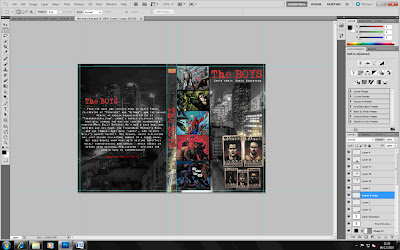
Finally I felt my DVD cover needed a picture on the back to make it look more interesting, i choose and image again that represented the action within the comics, I also wanted an image that displayed lots of the characters. Again with this image I used black lines to denote a comic book style.
I am pleased with the outcome of my dvd cover, however I feel that I could improve it with more time. I also feel If I had chosen a different product to promote, I could have used a lot more of the effects on photoshop. Because I was working with comic art I couldn't really adjust the graphics as much as I would have been able to had I chosen something else to promote.
As i need to add writing to the back of my dvd cover and the background is quite busy meaning it would be hard to read, i made a black rectangle to put the text on at the back
However I felt that a solid black rectangle looked quite messy so I then decided to adjust the opacity so you can still see the background image but if i overlay white text it will be easy to read.
I am pleased with the effect this has had once I added the text to the back.
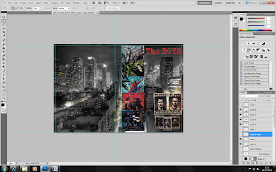
The Boys is very action packed, so I wanted to include some of the action art from the books. I felt the best way to display this was in a comic strip style along the side of the DVD.
however just copy and pasting the images looked sloppy and it was not clear that they were in a comic book style, decided to add in thin black lines framing each image to display them in more of a comic book fashion.
I feel this now looks more professional.
I wanted to include all of the main characters on the front of the dvd. At first I tried to select individual pictures of the characters from different sections of the comics, although this meant I could display more of the individual protagonists characters, the effect against the background made it look cheap. Instead i decided to use the "wanted" posters from the front cover off one of the issues, as they are posters it means that them look flat against the background was not a problem.
I would like to perhaps also link these posters into the background by reducing them in size and attaching them to some of the buildings in the background, I feel this would be an interesting effect.
Title
My second decision after the background was about the main title on the dvd cover. I felt the text used on the cover's of the comics was very powerful and would aslo give my work a strong sense of identity. I used to magic wand tool to select my text, at first i had a little trouble with this as i was trying to take the text from a background which was not contrasting enough with the colour of the text. When i came to this realisation i simpley used an issue of the comic with a black background meaning none of the text or impact of the font was lost.
I then pasted my text on to the background, I feel it is very powerful with the contrast of the dark background and the bold and bright lettering.
Wednesday, 1 December 2010
Background Image
The image of New York I have decided to use is this one:
The effects on this image give it a slightly animated feel which links with the product being a comic book.
I really like the lighting in the image as well I feel it really helps to illustrate the vastness of New York as a city.
If i use colourful images from the comic, I think they will contrast well and stand out on a background like this.
After I had chosen my background image I opened it in photoshop in the correct dimensions for a dvd cover using these dimensions:
Barcellos,P 2007 New York City Available at:<http://www.blogwaw.com/2007/07/new-york-city/>
Subscribe to:
Comments (Atom)


