Wednesday 8 December 2010

I did all of my editing on my own computer, then when I had to move it to one of the ones in the lab I had a few difficulties finding all the components of the video, I sorted it out in the end and managed to edited it further in the lab. I then rendered the work and saved it to disc.


I was pleased with my final product however I wish I'd had better quality videos and more time to do the film.
I created the title for my film in photoshop as I wanted the text to be the same as on both the dvd cover and the label, I also used the same background as I did for my dvd label.


Using premiere pro was a bit different for me as I am used to using final cut pro, however I found it easy to navigate, I started off by cutting my clips down using the razor tool so that I had about 1 minute of footage, I then decided to incorporate pictures from the comics into my film, I decided to edit them quickly together to make it more interesting to watch. I decided to split the film into two one half showing the main protagonists and the others showing there enemies the superheros, I felt this was the basic information that the viewer needed to understand.

One minute film

I was really excited to start making my film as my aim is to become an editor, but yet again I kicked myself over the subject matter I had chosen. Had i had more time I would have really loved to make an animation around the boys and this is something I aim to do in the future. After deciding that animation was probably something I could not achieve at least not to a high standard, I started to think of other ways I could portray the action but also tell the storyline of The Boys, I needed my film to be quick and snappy but also clear and concise so that the audience would understand what product I was promoting. I look through you tube for ages trying to find some fan videos when I came across interviews with the writer and artist, they were quick interviews which made them snappy but there where a lot of them so I new if I picked the write ones I could explain what The Boys was all about to someone how had never heard of it before in a minute. I went through all of the interviews and selected two one from the writer and one from the artist. The were each about 3 minutes long so I had to cut them down. My next step after selecting the footage I would use was selecting the song, because I like to work to the music when I am editing. The song I chose was a Stylust remix of Eminems Superman, I felt the term superman fitted well with the subject matter and the remix gave me a fast pace to edit the film to.
I designed my label around the image I had found. I was difficult to get each character in the right place and to make it look neat because of the dimensions i was working with. It took a lot of tweaking to get it right.
I decided to use the same lettering on my dvd label to maintain the product identity, I used the magic wand tool again to achieve this. My dvd label is simple but I think that is a positive I don't think you need to have too much going on on a dvd label.


Ideally none of the faces would be cut out at all, however with the image I was working with this was not possible, I feel I got the best result I could.


DVD Label


I started to design my dvd label by making to circles with these dimensions on photoshop. 


As soon as I started to think of a dvd label in context to the comic the boys, I thought of one image used for the front cover of an issue depicting the main characters which would work really well on a dvd.


The placement for each character gives the effect of a circle mean it would be perfect for a dvd label.

Finally I felt my DVD cover needed a picture on the back to make it look more interesting, i choose and image again that represented the action within the comics, I also wanted an image that displayed lots of the characters. Again with this image I used black lines to denote a comic book style.


I am pleased with the outcome of my dvd cover, however I feel that I could improve it with more time. I also feel If I had chosen a different product to promote, I could have used a lot more of the effects on photoshop. Because I was working with comic art I couldn't really adjust the graphics as much as I would have been able to had I chosen something else to promote. 


As i need to add writing to the back of my dvd cover and the background is quite busy meaning it would be hard to read, i made a black rectangle to put the text on at the back


 However I felt that a solid black rectangle looked quite messy so I then decided to adjust the opacity so you can still see the background image but if i overlay white text it will be easy to read.


I am pleased with the effect this has had once I added the text to the back.


The Boys is very action packed, so I wanted to include some of the action art from the books. I felt the best way to display this was in a comic strip style along the side of the DVD.


however just copy and pasting the images looked sloppy and it was not clear that they were in a comic book style, decided to add in thin black lines framing each image to display them in more of a comic book fashion.


I feel this now looks more professional.


I wanted to include all of the main characters on the front of the dvd. At first I tried to select individual pictures of the characters from different sections of the comics, although this meant I could display more of the individual protagonists characters, the effect against the background made it look cheap. Instead i decided to use the "wanted" posters from the front cover off one of the issues, as they are posters it means that them look flat against the background was not a problem. 


I would like to perhaps also link these posters into the background by reducing them in size and attaching them to some of the buildings in the background, I feel this would be an interesting effect.


Title

My second decision after the background was about the main title on the dvd cover. I felt the text used on the cover's of the comics was very powerful and would aslo give my work a strong sense of identity. I used to magic wand tool to select my text, at first i had a little trouble with this as i was trying to take the text from a background which was not contrasting enough with the colour of the text. When i came to this realisation i simpley used an issue of the comic with a black background meaning none of the text or impact of the font was lost.


I then pasted my text on to the background, I feel it is very powerful with the contrast of the dark background and the bold and bright lettering. 


Wednesday 1 December 2010

Background Image

The image of New York I have decided to use is this one:


The effects on this image give it a slightly animated feel which links with the product being a comic book.
I really like the lighting in the image as well I feel it really helps to illustrate the vastness of New York as a city.
If i use colourful images from the comic, I think they will contrast well and stand out on a background like this.

After I had chosen my background image I opened it in photoshop in the correct dimensions for a dvd cover using these dimensions:


Barcellos,P 2007 New York City Available at:<http://www.blogwaw.com/2007/07/new-york-city/>

Monday 29 November 2010

I've decided for the background of my dvd cover i want to use a landscape, picture of New York city. This will set the scene for the consumer, the setting of the comic is also important to the mood and storyline of the comic, it is important to get acrosss the the consumer the scale of the city and how easy it is to get lost in. The images of new york i've found are dark this carrys on from the theame of the comic.


Anonymous [print] available <http://www.easyart.com/art-prints/Anonymous/New-York-Skyline,-Summer-104890.html>


Siberman, H [print] available <http://www.thefineartcompany.co.uk/photos/PHOTOGRAPHY-lw24.htm>


Barcellos,P 2007 New York City Available at:<http://www.blogwaw.com/2007/07/new-york-city/>

Monday 25 October 2010

Mood Board


Whitaker,S 2004 New York, New York 3 [Photgraph] Available at:<http://www.artshole.co.uk/staceywhitaker.htm>
Barcellos,P 2007 New York City Available at:<
http://www.blogwaw.com/2007/07/new-york-city/>
Robertson,D 2008 The Boys Available at:<http://movieandtvnews.blogspot.com/2008/01/journeyman-secret-life-of-bees-tv-dvd.html>
American Physco, 2000 [Film] Directed by Mary Harron, USA:Universal Studios
Robertson, D 2007 The Boys Available at:<http://forums.comicbookresources.com/showthread.php?t=288468>
Act Of War, Direct Action, 2005 available at:<
http://wallpaper-s.org/18__Act_of_War,_Direct_Action,_2005.htm>
Batman Daily Newspaper Strip II, Part 8, 1968 available at:<
http://www.aquamanshrine.com/2008/01/batman-daily-newspaper-strip-ii-part-8.html>

Monday 27 September 2010

The Boys

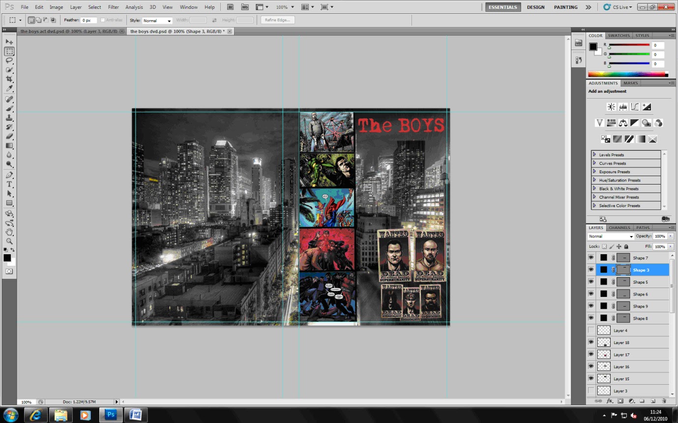
I have decied to promote a comic book series as my portofolio. The series I have choosen to promote is "The Boys" written by Garth Ennis and illustrated by Darick Robertson. I chose to promote this particular product is because firstly I am very interested in comic art. Secondly it is because as a comic it is realatively underground, and has had little promotion previously allowing me to put completley my own spin on the promotion of the product. I also feel that despite the previous lack in promotion of this product, it could actually appeal to quite a wide audience. 


The genre of "The Boys" is black comedy, it is also a very gory comic. These things are important to consider when promoting it as the conjuer up very strong images and colour schemes. The colour scheme used on the image above, definitely protrays gore, violence and of something sinister, all things which are definitely very prominant within the comic. This colour scheme is certainly one I would consider using within the promotion of this product, however I feel perhaps not enough of the humour of "The Boys" is portrayed using these colours. 
Pictures 1 & 2 Robertson,D & Ennis,G June 2007 "The Boys - Name Of The Game"
Picture 3 Robertson,D & Ennis, G March 2008 "The Boys- Get Some"